Skip to content

Textured Paint Ideas for Malaysia: Feature Walls That Sell the Space (for Designers, Homeowners & Architects)

Walk into any well-designed home, showroom, café, or office—and there’s usually one wall that quietly does the heavy lifting. It anchors the room, makes the lighting feel intentional, and turns a “nice” space into a memorable one.

texture paint

That wall is often texture paint (also searched as texture paint Malaysia, cat tekstur dinding, cat bertekstur, concrete effect wall, Venetian plaster / Italian plaster look, lime plaster, marmorino, stucco).

What is texture paint?

Texture paint is a decorative wall finish that adds depth, movement, and surface variation—so light doesn’t just bounce off the wall, it plays across it.

That’s why textured walls look:

  • more premium in real life

  • more “designed” in photos/videos

  • less flat compared to standard emulsion paint

In Malaysia, texture finishes typically fall into these popular looks:

  • Matte mineral texture (soft, calm, powdery, modern)

  • Polished plaster / Venetian plaster look (smooth movement + subtle sheen)

  • Stucco / bold texture (stronger shadows, more tactile depth)

  • Concrete / cement effect (urban, clean, modern—“efek simen”)

  • Waxed / metallic highlight effects (protection + luxury accent glow)

10 Feature Wall Ideas Interior Designers Actually Re-use (because they work)

“Soft Greige Mineral” for warm modern homes

A matte mineral texture in warm greige/off-white is a cheat code for:

  • condos with limited natural light

  • homes that want “quiet luxury”

  • spaces where furniture and art should stand out

Designer tip: keep skirting and ceiling clean—let the wall be the texture, not the trim.

Concrete Effect” for cafés, offices, and bachelor interiors

Concrete texture looks best when it’s controlled—not too patchy, not too busy.
Perfect for:

  • cafés and retail branding walls

  • reception counters / waiting areas

  • minimalist bedrooms with dark wood or black accents

Pair with: black metal, walnut, linen upholstery, warm 3000K lighting.

Polished Movement Wall” behind the sofa

A subtle polished plaster look gives a luxury read without shouting.
Use it when:

  • the living room needs a signature background

  • the client wants “hotel vibe” but still cozy

  • you want a wall that changes through the day with light

Lighting tip: wall-washer or angled downlights make movement look expensive.

Stone-inspired vertical flow” for tall staircases

Staircase walls love texture because they’re big and usually under-designed.
Vertical movement elongates the space and makes the staircase feel architectural.

Headboard halo” in matte texture + warm lighting

Instead of a full dramatic wall, do a softer texture and let lighting create the drama.

  • warm LED strip behind headboard

  • matte texture that catches soft shadow

  • calm colour like sand, oat, warm grey

Two-tone texture” for zoning open spaces

In open-plan layouts, textured paint can define zones without partitions:

  • dining zone slightly warmer

  • living zone slightly cooler

  • same finish, different tone = cohesive but intentional

Texture + timber” for instant premium

Texture paint next to timber slats, timber panels, or veneer always upgrades the feel.

  • keep timber warm

  • keep texture calm

  • let the contrast do the work

Accent niche / arch” for small budgets

If the client won’t commit to a whole feature wall, texture the niche/arch:

  • easier budget approval

  • high impact

  • looks custom-built even in standard units

Illuminated sign for Ticco restaurant

Retail brand wall” with controlled texture + logo lighting

A textured wall behind a brand logo makes the logo feel more premium.
Best practice: keep texture consistent so the signage stays readable.

Low-sheen protective topcoat” for high-touch areas

Feature walls in corridors, kids’ areas, and near dining zones need smarter finishing.
Choose a system that allows easy maintenance without ruining the look.

See More At: Our Project reference

Colour directions that sell fast in Malaysia

Modern room with large windows

Clients often say “I don’t want it too dark” or “I want it modern but warm.” These are safe winners:

  • Warm whites: creamy off-white, bone, soft ivory

  • Greige family: beige-grey that looks expensive with wood tones

  • Soft warm grey: modern without turning cold

  • Sand / oat / earth tones: very natural, very “designer”

  • Charcoal accents: use sparingly for commercial or bold concepts

Pro tip for designers: pick colour based on lighting temperature. A 3000K warm light will change grey dramatically.

Specification notes (for architects & detail-focused designers)

If you’re specifying textured paint in Malaysia, these points prevent most site issues:

  • Substrate matters: uneven skim coat will show through polished finishes

  • Moisture zones: bathrooms and wet areas need correct system selection + protection

  • Joint lines & repairs: texture can hide minor issues, but bad patching can still telegraph

  • Mock-up is not optional: do a sample board / sample corner before full application

  • Lighting plan affects final look: downlight position can make or break texture movement

  • Maintenance expectation: set cleaning guidelines upfront (especially commercial)

Common mistakes that make textured walls look “cheap”

  • Too many feature walls in one space (one hero wall is usually enough)

  • Random “busy” movement without design intention

  • Wrong lighting (flat light = flat wall)

  • No sample approval (client shock after completion)

  • Skipping protection in high-touch areas

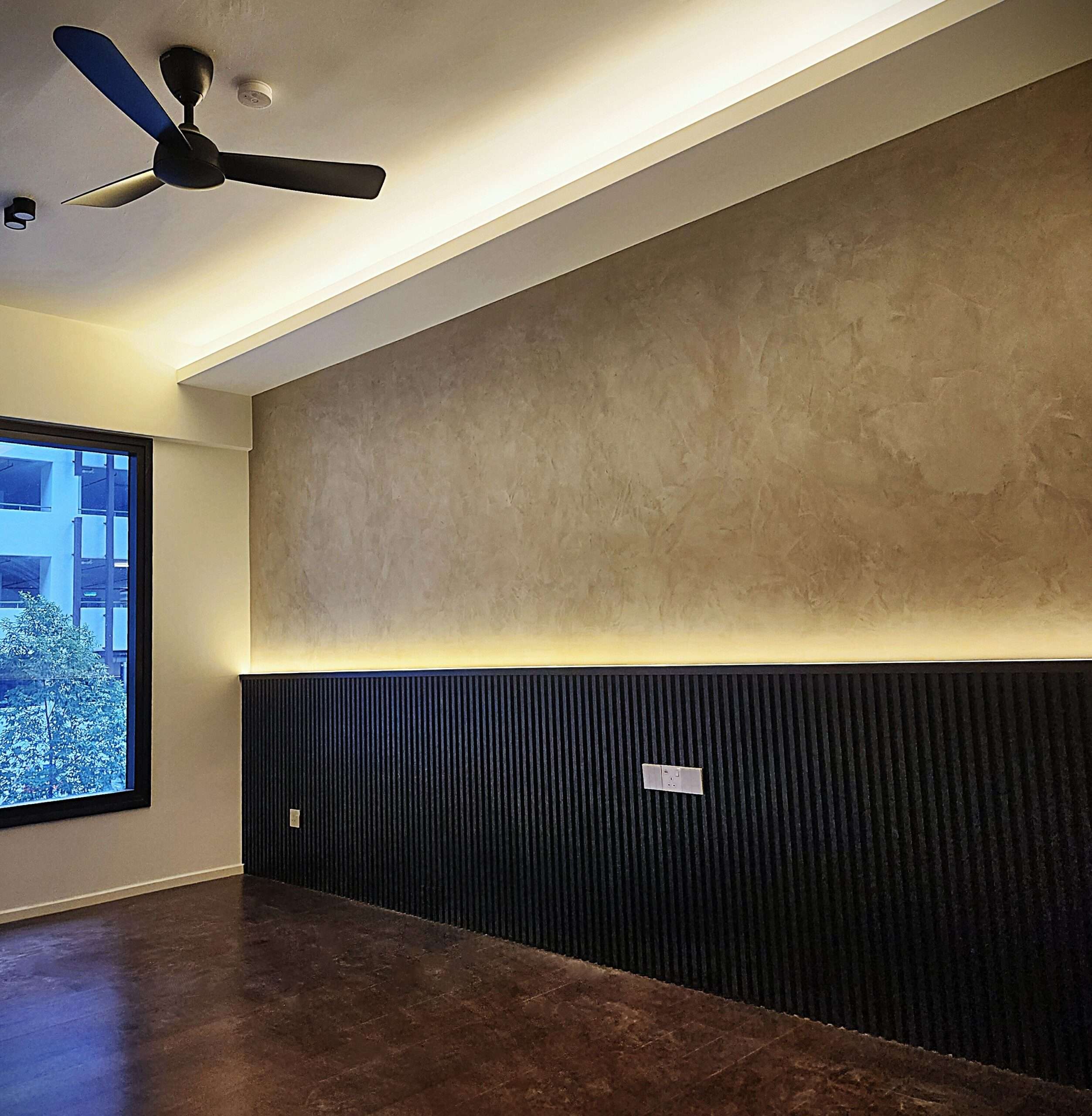
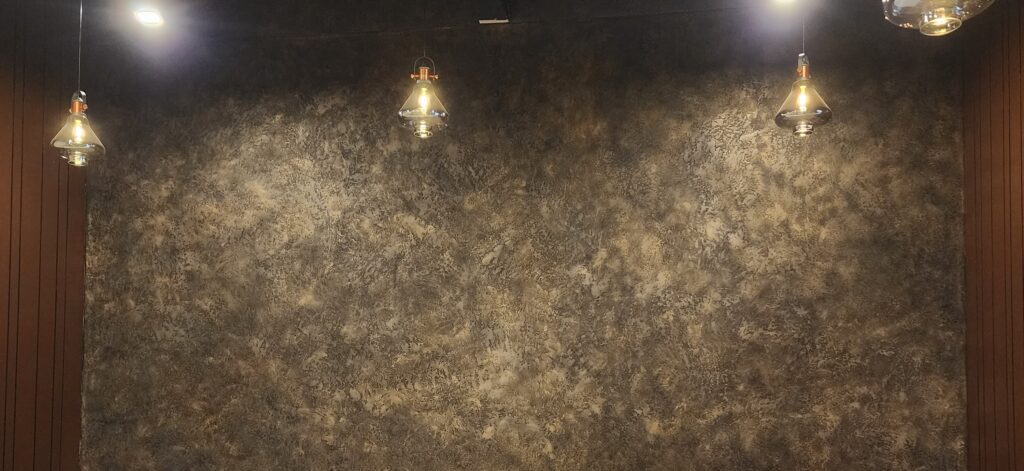
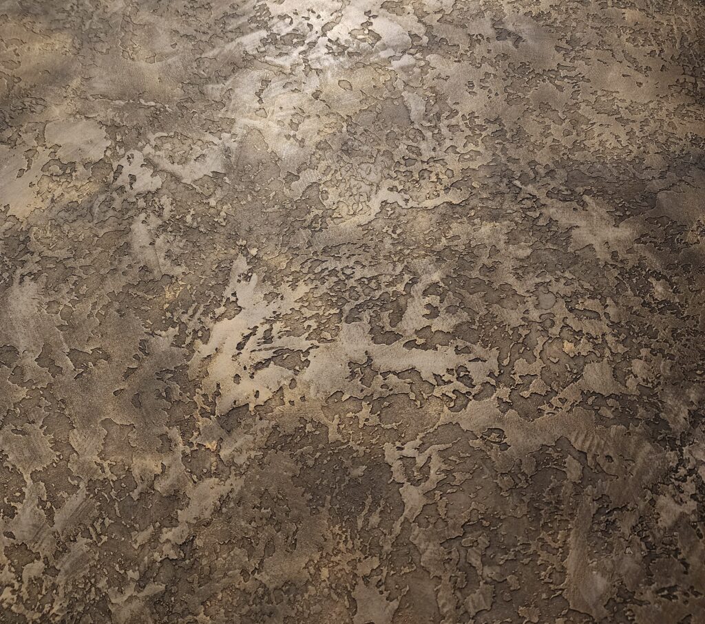
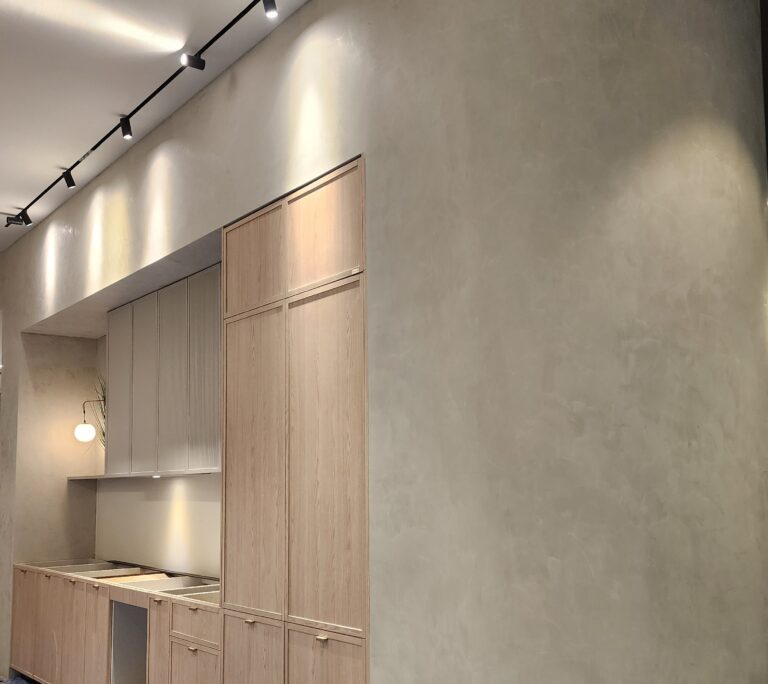
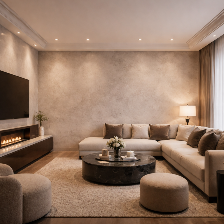
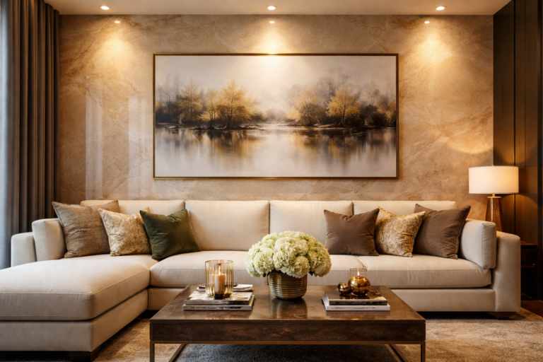
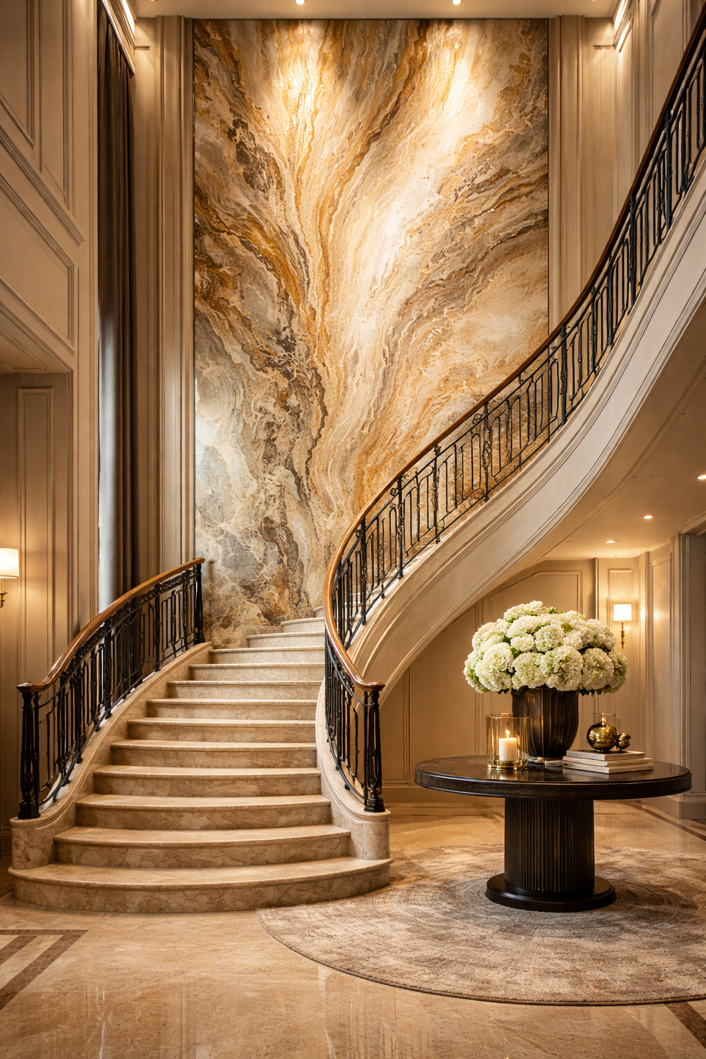
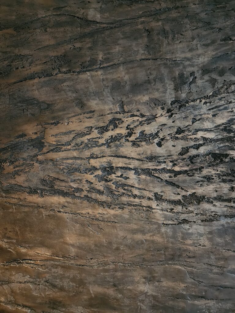
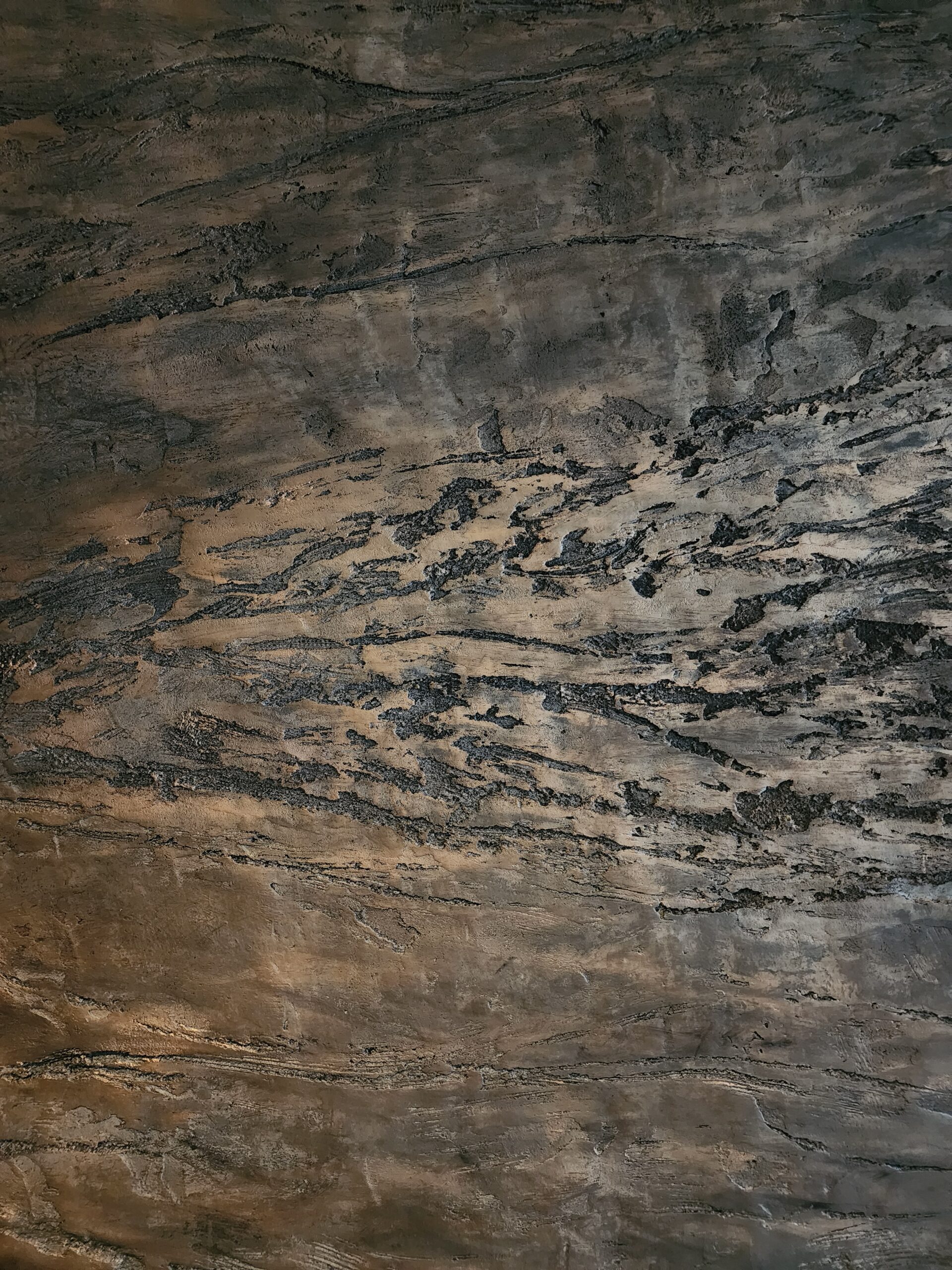
Macoavell has gradually establish itself as one of the more popular texture paint brands in Malaysia. It is not loud or overly flashy, but quietly consistent—appearing in homes, cafés, and projects where surface detail truly matters. What stands out is its approach, focusing on craftsmanship, surface quality, and allowing the finished walls to speak for themselves rather than relying on hype.

Visit our site: https://macoavell.com/